The most iconic logos weren’t born perfect, they evolved.
Apple didn’t start with a sleek bitten apple.
Pepsi didn’t begin with a bold wave.
Google didn’t always look this clean.
Every great brand you admire today went through years of refinement simplifying, clarifying, and adapting to the times.
Because a logo isn’t just a design.
It’s a living symbol that grows as the brand grows.
And the evolution of these logos tells a powerful truth:
The stronger a brand becomes, the simpler its identity gets.
In this issue, we’ll break down how the world’s most famous logos transformed
and the lessons you can apply to your own design work.
Why Logos Evolve
Logos don’t change because brands get bored, they change because the world does.
Here’s why even the biggest brands evolve their marks over time:
1. Relevance, Staying in Sync with Culture
Design trends shift. Consumer expectations shift.
A logo that felt modern 15 years ago might feel outdated today.
Evolving the mark helps a brand stay relevant, relatable, and culturally aligned.
2. Simplicity, Improving Recognition & Scalability
As brands grow, their logos need to work everywhere:
app icons, billboards, product packaging, watches, EV screens.
Simpler logos scale better, load faster, and are easier to remember.
3. Strategy, Matching the Brand’s Direction
Companies evolve, from product to ecosystem, from niche to global.
Their logo should reflect that shift.
A redesign often signals:
a new positioning
a fresh audience
a broader vision
a clearer identity
The logo becomes the visual announcement of growth.
Famous Logo Evolutions
Every famous logo we know today has a journey.
Each evolution teaches something powerful about branding, clarity, and longevity.
Let’s break down 5 iconic examples:
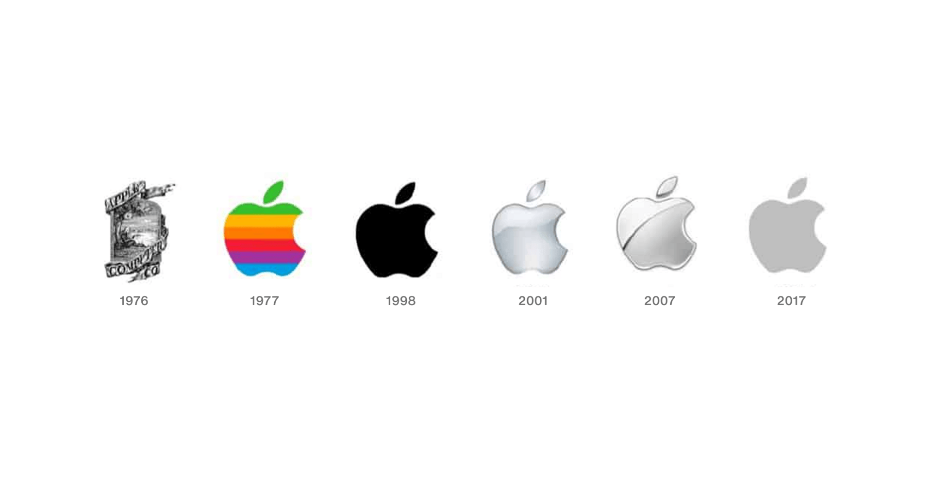
1. Apple
Then: A detailed, illustrated scene of Newton sitting under a tree.
Now: A simple, clean, universally iconic bitten apple.
Why it evolved:
To remove unnecessary complexity and create a mark that works anywhere, on a device, a box, a billboard.
Lesson: Simplicity is timeless. The strongest ideas need fewer lines, not more.
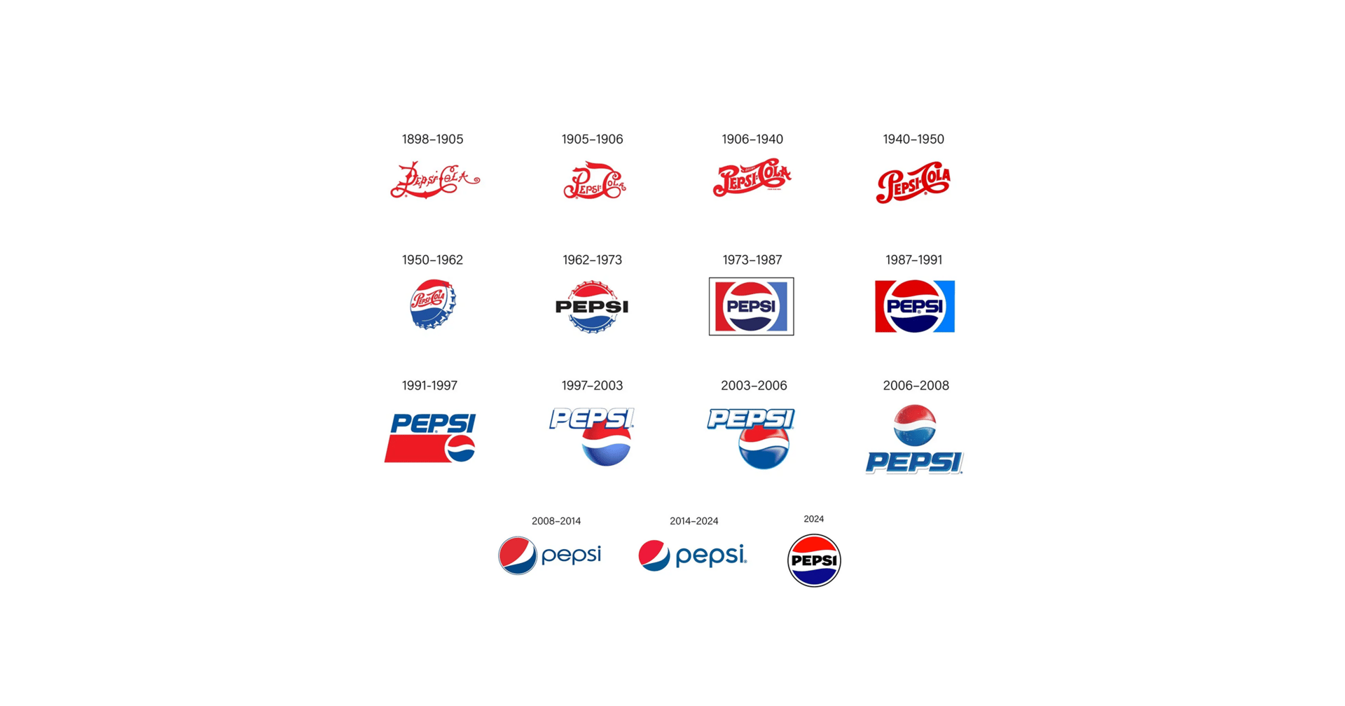
2. Pepsi
Then: Ornate, decorative typography with vintage flourishes.
Now: A bold, confident wave symbol paired with modern typography.
Why it evolved:
To modernize continuously while keeping the red/white/blue DNA intact across decades.
Lesson: You can evolve dramatically and still stay unmistakably you.
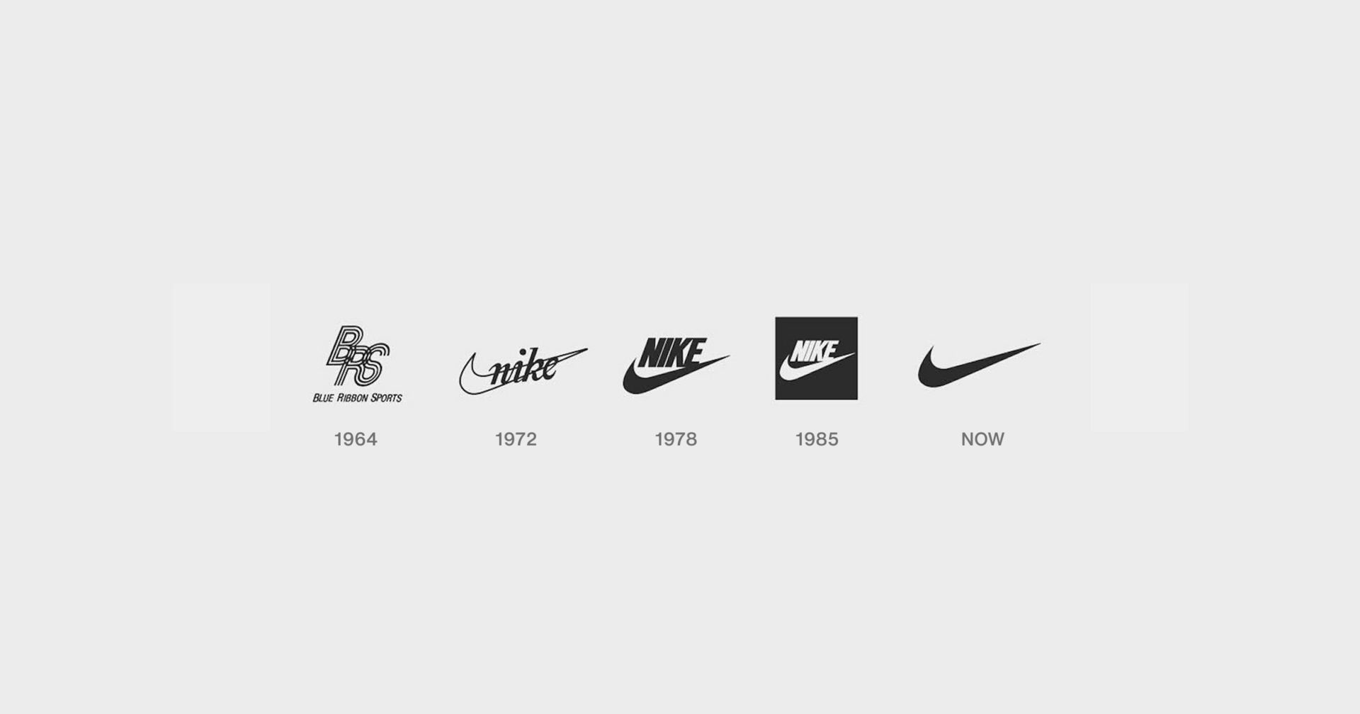
3. Nike
Then: The swoosh paired with a chunky “NIKE” wordmark.
Now: The swoosh standing alone, pure, confident, iconic.
Why it evolved:
The original idea was strong. It only needed refinement and simplification.
Lesson: A great concept doesn’t need reinvention, only polish.
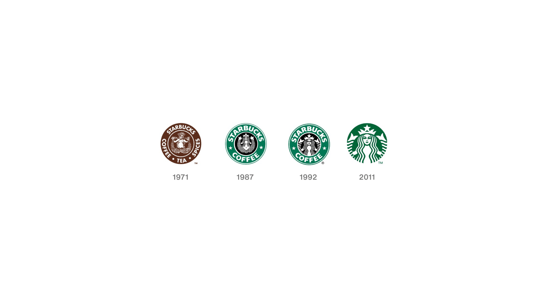
4. Starbucks
Then: A complex mermaid emblem with text rings and heavy details.
Now: A cleaner, simplified siren, no text, no clutter, just identity.
Why it evolved:
To modernize the mark while preserving its storytelling roots and heritage.
Lesson: Remove the noise, keep the soul.
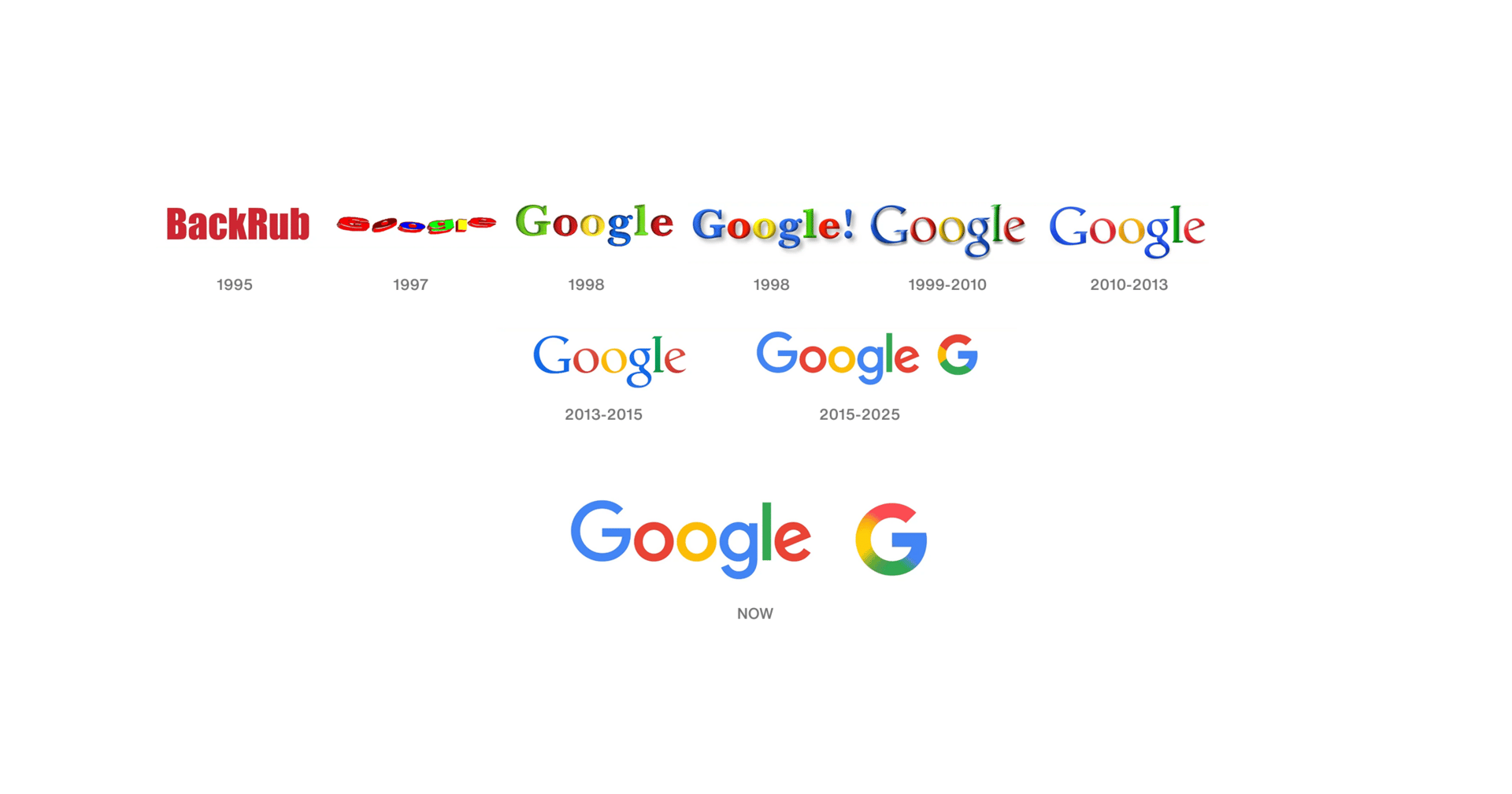
5. Google
Then: Skeuomorphic, 3D letters with shadows and bevels.
Now: A minimal, geometric logotype built for clarity and screens.
Why it evolved:
To become more digital-friendly, scalable, and consistent with modern UI design.
Lesson: Adapt to your environment, especially if your brand lives on screens.
Studying the evolution of famous logos isn’t just nostalgia
it’s a masterclass in how strong brands are built.
Here are the key lessons every designer should take away
Shoppers are adding to cart for the holidays
Over the next year, Roku predicts that 100% of the streaming audience will see ads. For growth marketers in 2026, CTV will remain an important “safe space” as AI creates widespread disruption in the search and social channels. Plus, easier access to self-serve CTV ad buying tools and targeting options will lead to a surge in locally-targeted streaming campaigns.
Read our guide to find out why growth marketers should make sure CTV is part of their 2026 media mix.
1. Simplicity Improves Recognition
The simpler the form, the faster the brain remembers it.
Great logos aren’t clever, they’re clear.
2. Refinement Is Growth, Not Inconsistency
Updating a logo doesn’t mean the old one was wrong.
It means the brand has grown, and the identity needs to grow with it.
The best logos evolve quietly, a cleaner line, a better proportion, a bolder shape.
3. Your Logo Should Evolve With the Brand
When a company shifts its mission, audience, or product
the identity should reflect that transformation.
A logo stuck in the past can hold the brand back.
4. Strong Ideas Survive Trends
Swoosh. Apple. Golden Arches.
These marks didn’t rely on trends, they relied on timeless thinking.
If the idea is strong, you don’t need effects, gradients, or noise.
A powerful concept stands on its own.
Great logos don’t change for trends
they evolve for clarity, meaning, and relevance.
A logo is a living symbol.
It should grow as the brand grows, simplify as the story sharpens,
and adapt as the world around it shifts.
If your logo tells the same story it did 10 years ago… has your brand really grown?
Logo evolution isn’t about redesigning for the sake of change
it’s about refining who you are and the space you want to own.
Thanks for reading! We hope you enjoyed this edition and would consider forwarding it to a friend.
If you hated it, reply and let us know what we could do differently. Same time next week <3

