Hey Creatives
So I've been noticing some interesting shifts in what's working in design lately. Thought I'd break down what's actually catching my eye and why it matters.
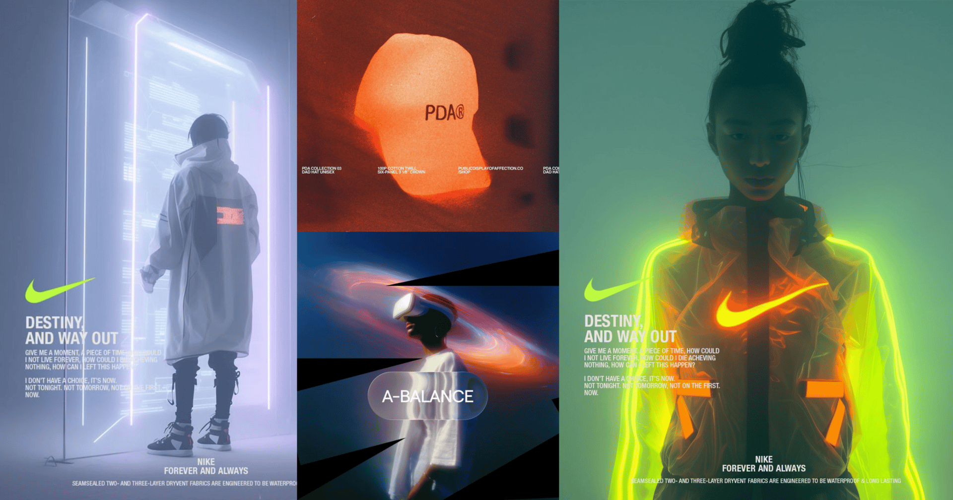
1. Cyber Neon
Electric neon colours, retro-futuristic gradients, VHS distortion vibes. Polished for the digital age
We're seeing these sleek, sci-fi interfaces with glowing accents that actually feel sophisticated.
The dark backgrounds are staying, but the neon is more intentional. Gaming platforms and fintech apps are nailing this look right now.
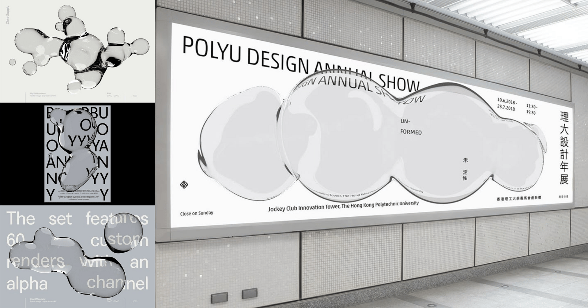
2. Liquid Design
Sharp edges are out. Liquid, flowing, morphing shapes are in. Bringing futuristic movement with an organic twist.
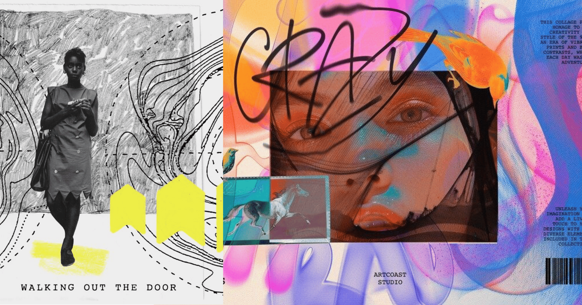
3. Collage and layered visual elements
Visible imperfections of the overlapping layers of collage offer depth and can foster a narrative, storytelling approach. Using mixed media, photos, doodles, stamps, and brush textures enhances the collage approach. Try soft fades for subtle dynamism in your branding.
This newsletter you couldn’t wait to open? It runs on beehiiv — the absolute best platform for email newsletters.
Our editor makes your content look like Picasso in the inbox. Your website? Beautiful and ready to capture subscribers on day one.
And when it’s time to monetize, you don’t need to duct-tape a dozen tools together. Paid subscriptions, referrals, and a (super easy-to-use) global ad network — it’s all built in.
beehiiv isn’t just the best choice. It’s the only choice that makes sense.
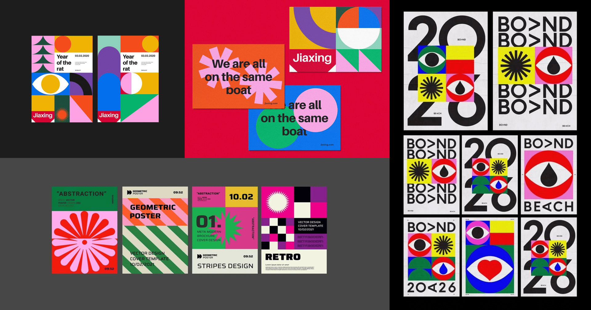
4. Geometric Design
Geometry is evolving with softer shadows and layers for added depth while maintaining a clean look. Some designers blend it with psychedelic influences for a surreal quality. It's structured yet has personality, ideal for interfaces and brand systems that need clarity without feeling cold.

5. Organic and imperfect design
Organic and analogue are showing up in hand-rendered and letterpress-inspired fonts, in earthy textures (sand, stone, bark), and in low-contrast, minimal forms. When branding for authenticity, designs in 2026 will often show elements of imperfection.

6. Maximalism & chaotic layouts
Minimal design is taking a break. We're going full chaos—clashing colours, layered type, hand-drawn illustrations, patterns on patterns. It's basically the 90s anti-design movement but updated for 2026.
Thanks for reading! We hope you enjoyed this edition and would consider forwarding it to a friend.
If you hated it, reply and let us know what we could do differently. Same time next week <3


