Hey Creatives
In today’s newsletter, we are going to show you the real-world process of creating a brand identity for a protein brand.
Building a brand isn’t just about making a logo or picking colors.
It’s about crafting a voice, a vibe, and a reason to exist in the first place.
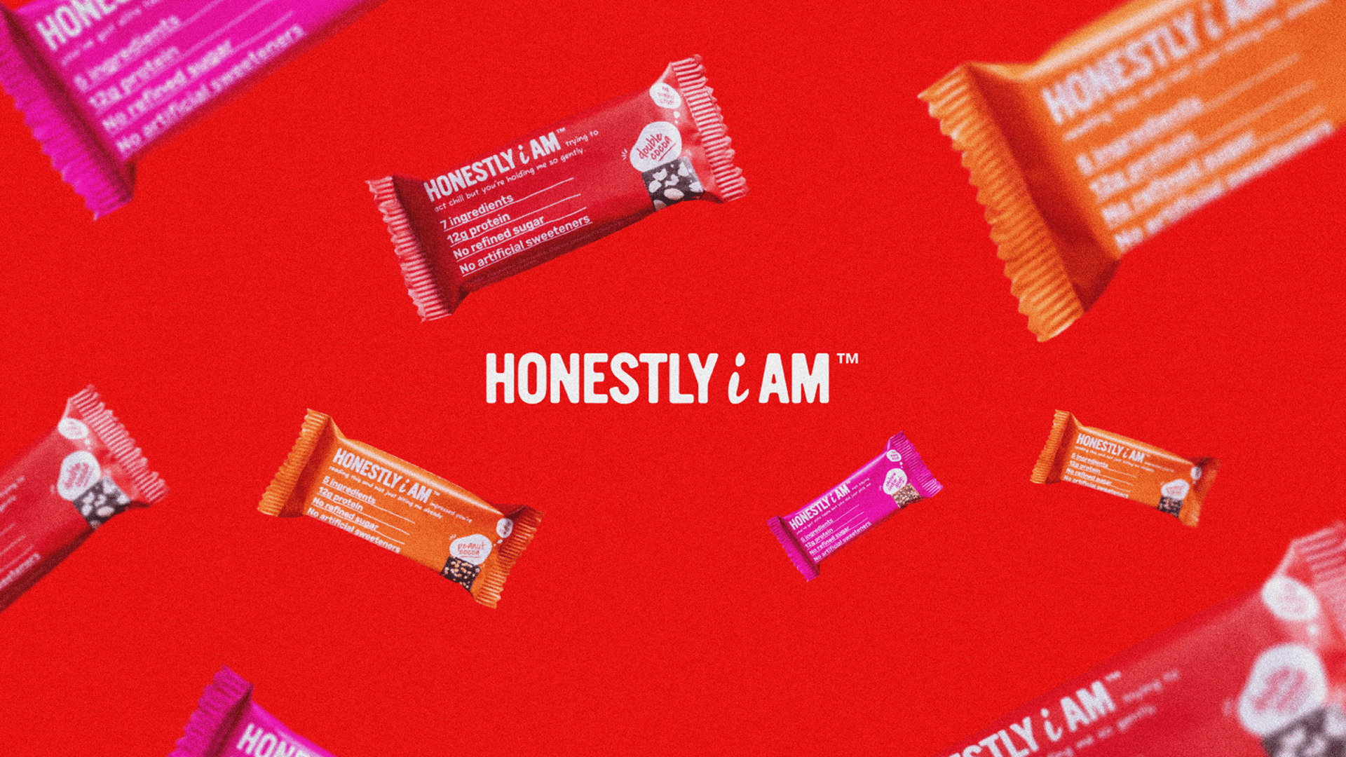
In this newsletter, I’m breaking down exactly how we built Honestly, I Am — a radically honest, clean-label protein bar brand launching in the UK from the ground up.
Let’s dive into the full branding journey:
The Brand Strategy
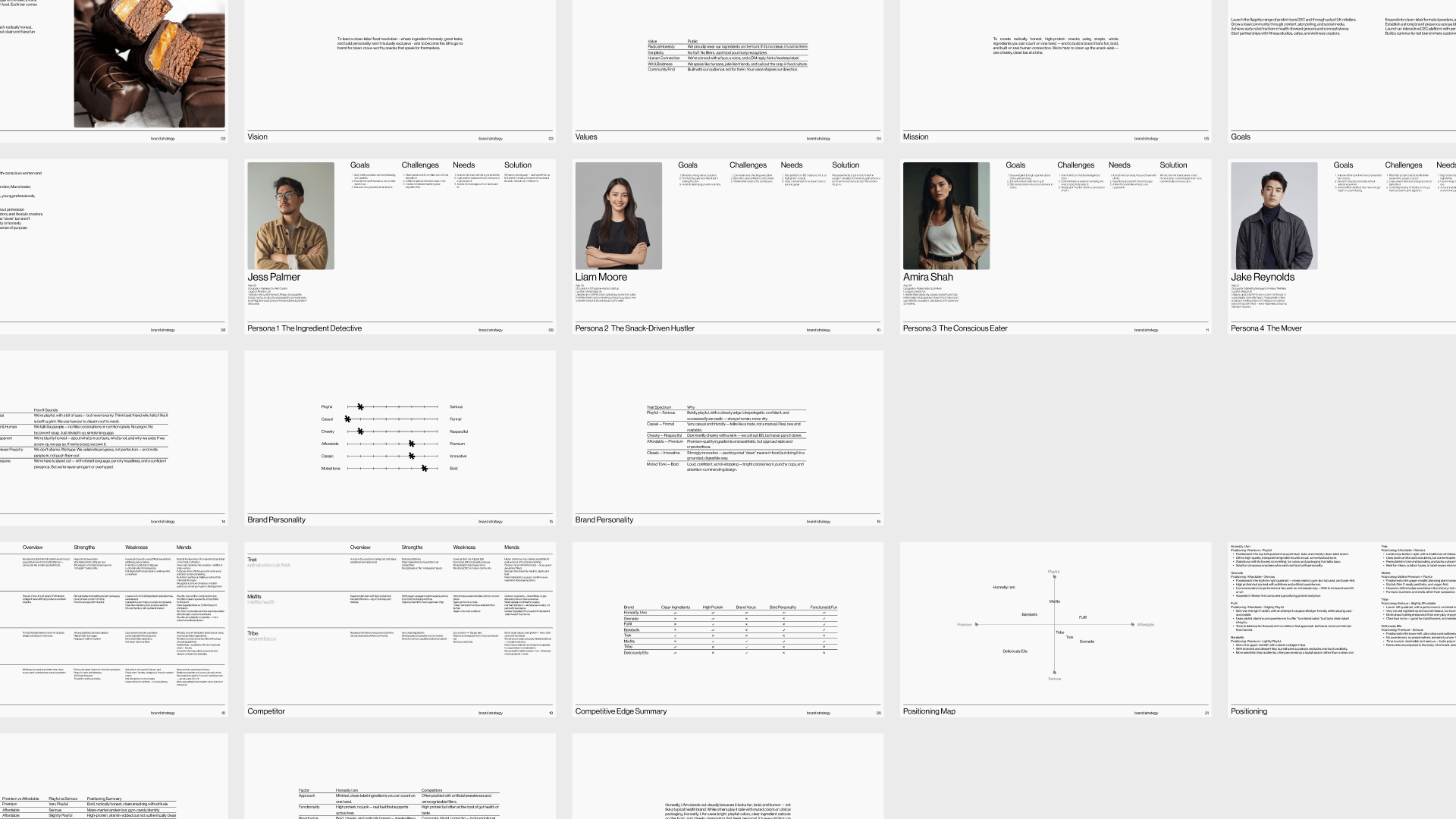
We never begin with visuals. First, we go deep into strategy the brain behind the brand.
For Honestly, I Am, we started by defining:
The brand story: born out of frustration with "healthy" snacks that aren’t actually healthy
The vision: to redefine clean eating with honesty, humour, and boldness
The mission: to create genuinely clean, high-protein snacks using ingredients you can count on one hand
The core values: radical honesty, simplicity, human connection, wit, and community
The brand goals: launch in the UK D2C and retail space, expand to other formats like powders and spreads, and grow a strong content-driven community
Then we moved into audience research, focusing on Gen Z and conscious snackers who care about labels, but also vibe with bold, real storytelling.
We built out 4 key personas (The Ingredient Detective, The Hustler, The Mover, and The Conscious Eater), each with their goals, pain points, and what they’re really looking for in a brand.
Finally, we did a competitive analysis comparing Honestly, I Am with brands like Grenade, Fulfil, Barebells, Misfits, and Deliciously Ella to find a clear white space:
High-protein + clean ingredients + bold voice = no one’s doing all 3 well.
The Creative Direction
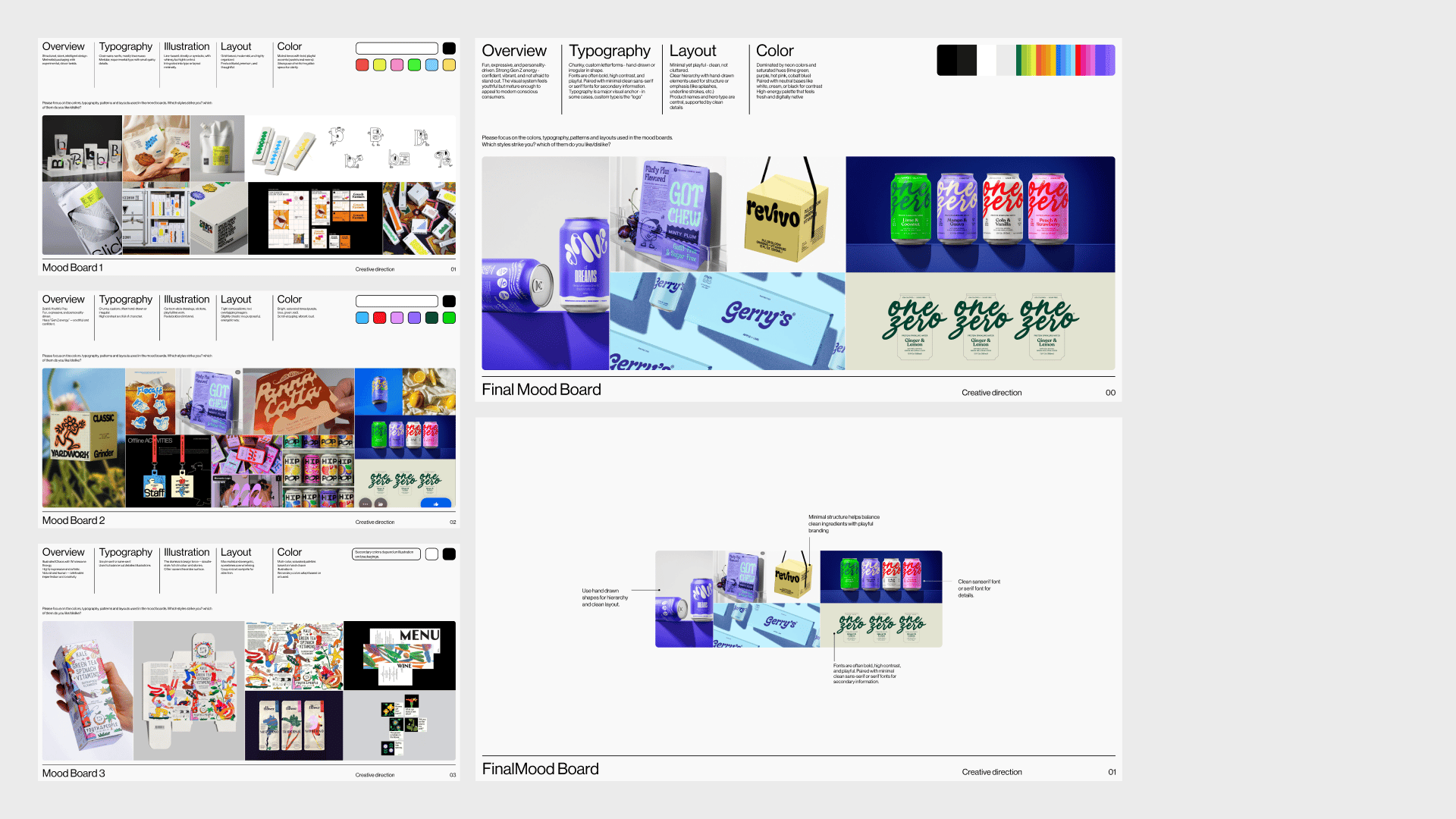
With strategy locked in, we translated all of that into visual feeling.
We built multiple mood boards, each rooted in different interpretations of the brand personality:
One was bold, expressive, Gen Z-friendly
Another leaned minimalist and clean
A third explored illustrated storytelling
We looked at colors, type styles, packaging layouts, and real-world references. From this, we aligned with the client on a creative direction that was:
Loud but clean, Youthful but premium, Playful but purposeful
Typography & Color
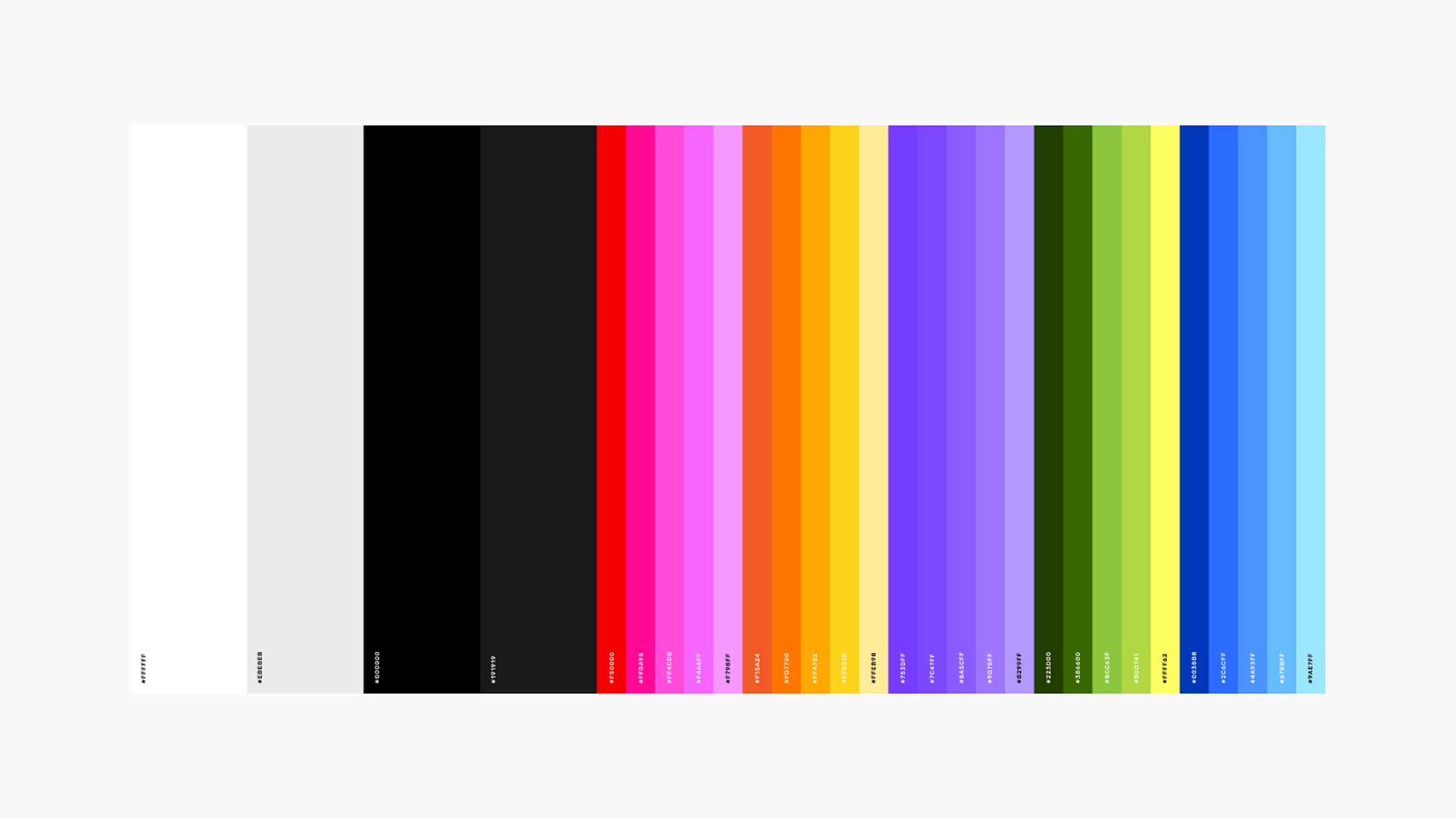
Before designing the logo, we selected the type system and color palette.
Why? Because the typography and colors set the entire mood.
For Honestly, I Am, we chose:
Bold, chunky, character-filled fonts
Clean sans-serifs for secondary content
A vibrant color palette with expressive, high-contrast tones designed to pop both digitally and on shelves
This phase helped us define the visual rules and made every design choice easier from here on.
Logo Design
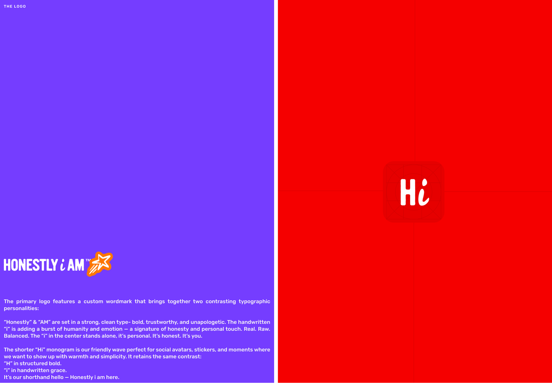
When it came to the logo, we chose to lead with a wordmark.
The name Honestly, I Am was powerful on its own.
It didn’t need a symbol, it needed a voice.
We explored sketch directions, handwritten styles, bold variations, and how the logo could evolve across packaging, social, and merch.
We focused on legibility, boldness, and how it would pair with secondary typography and color blocks.
Building the Identity

Once the logo, type, and colors were set, we moved into building the full identity system.
This included:
Defining a consistent illustration style (minimal but expressive)
Establishing layout systems for packaging, posters, and social
Creating brand assets like stickers, pattern systems, tone-of-voice guides, ingredient stamps, bar “personalities,” and more
This is where the brand really came to life.
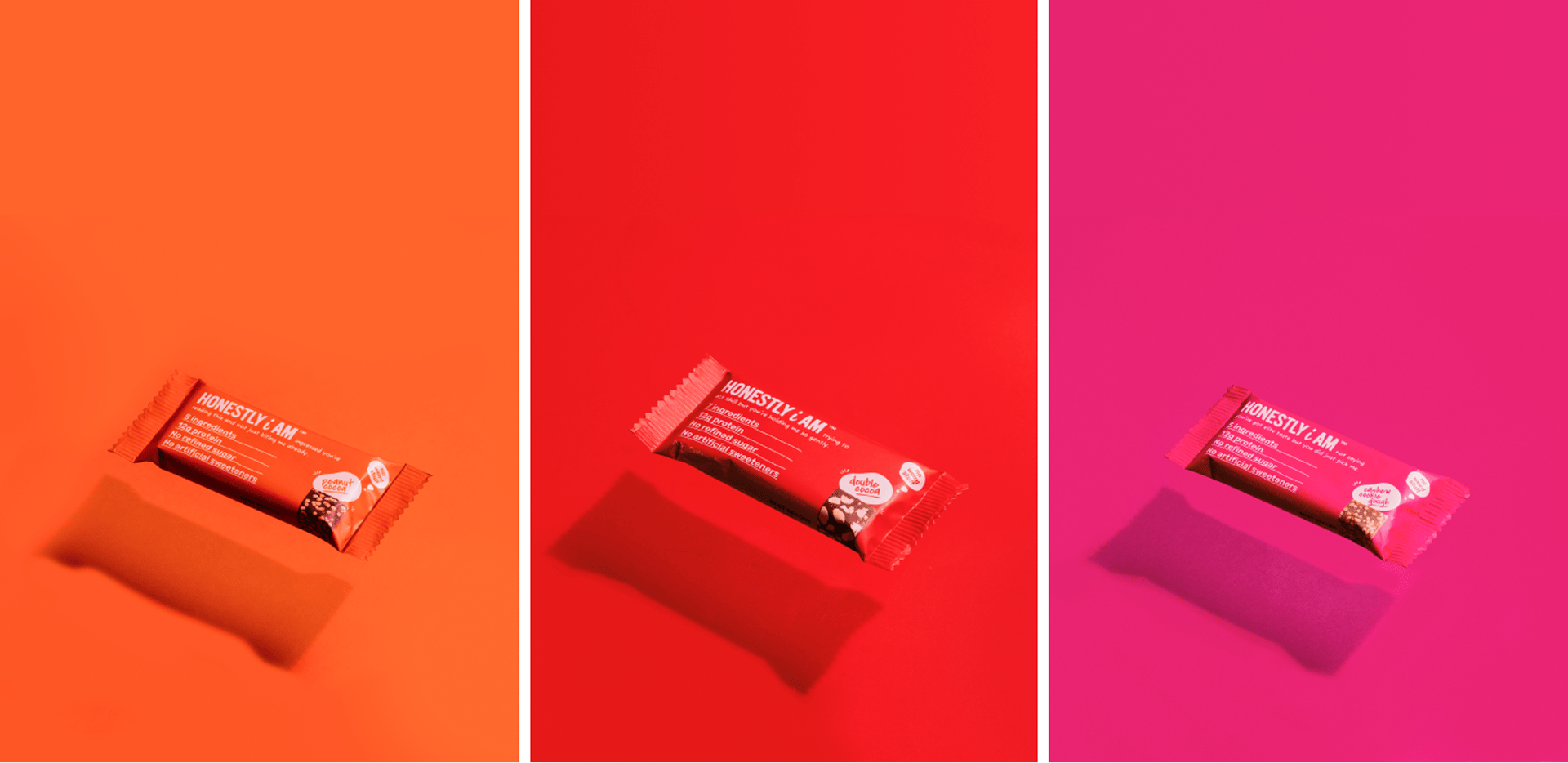
Each bar had its own voice. The system felt cohesive. And the visual tone matched the boldness of the product.
Banish bad ads for good
Your site, your ad choices.
Don’t let intrusive ads ruin the experience for the audience you've worked hard to build.
With Google AdSense, you can ensure only the ads you want appear on your site, making it the strongest and most compelling option.
Don’t just take our word for it. DIY Eule, one of Germany’s largest sewing content creators says, “With Google AdSense, I can customize the placement, amount, and layout of ads on my site.”
Google AdSense gives you full control to customize exactly where you want ads—and where you don't. Use the powerful controls to designate ad-free zones, ensuring a positive user experience.
The Brand Guidelines
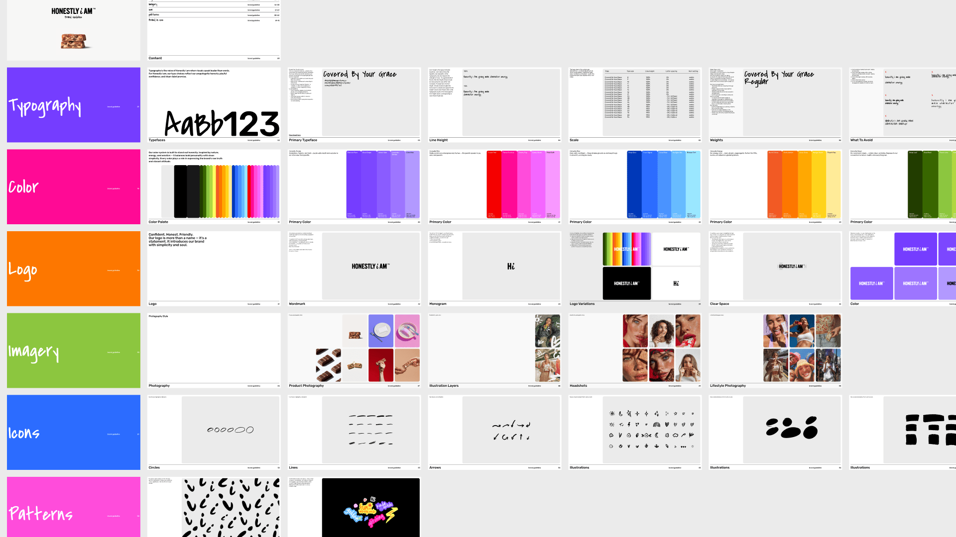
Finally, we created a full brand guidelines document.
This included:
Logo usage
Typography rules
Color values and accessibility
Packaging do’s and don’ts
Voice & tone reference
Sample applications (website, social, print)
This guide makes it easy for the client to scale the brand consistently with or without us across everything from campaigns to retail to future products.
Want to see the full project?
Here's the full case study on Behance → [ Behance ]
Thanks for reading! We hope you enjoyed this edition and would consider forwarding it to a friend.
If you hated it, reply and let us know what we could do differently. Same time next week <3


